Popover for DropTools
Version 1.0.2
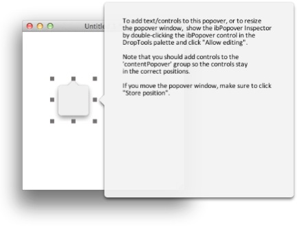
The ibPopover control mimics the behavior of popovers introduced in OS X Lion. Basically it is a translucent window with an arrow pointing to the source it was opened from. Popovers automatically move whenever the main stack moves. ibPopover also allows detaching to become a separate window. When the popover is detached it will no longer be moved when the main stack moves. Closing the detached window will make it open in it's original position when it is invoked the next time. Nondetachable popovers cannot be moved. Here is a picture of a new popover placeholder and window:
What this version is lacking is the ability to select the position of the arrow on each side. It will always be in the middle. My project didn't need so much fine-tuning and due to time restraints I didn't implement it. The other difference to the operating system popovers is that when dragging, the arrow will be shown.
When you drag a new ibPopover to your stack, it will create a placeholder that is a control in your stack and a substack with the same name as the control. The new substack has it's style set to 'palette' so it will float above the main stack. When renaming the objects, rename only the group ibPopover, it will automatically rename the ibPopover stack. Removing the ibPopover group will also remove the ibPopover stack.
The stack is not password protected so feel free to see how it has been implemented. If anyone does make improvements or has suggestions on what could be improved please let me know. I would appreciate if I could get the changes so I could update the control to benefit everyone.
This stack has been tested on Mac OS X. If you find bugs or verify that it works in other operating systems please let me know.
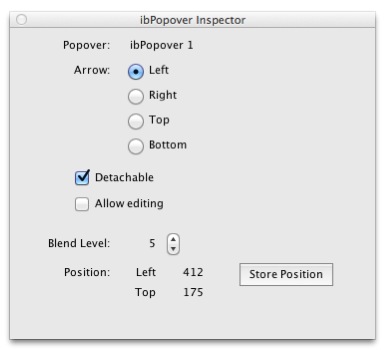
There are two ways to control the ibPopover: through the 'ibPopover Inspector' from the DropTools palette or by sending messages to the placeholder group on your stack.
The options available in the Inspector are:
- Arrow: choose on which side of the ibPopover the arrow will be.
- Detachable: if selected the ibPopover will detach into a separate window after dragging. Note that during development you can drag ibPopovers even though they are not detachable. In a standalone they cannot be moved.
- Allow editing: this will show the ibPopover as a top-level stack so that you can resize it and place controls into it. Please note that all controls should be placed within the group "contentPopover" so that the relative positions of the controls stay the same even though the arrow side changes.
- Blend Level: please set the desired blend level here as this will override the ibPopover stacks blend level setting. The default blend level is 5 but can be changed to any value desired.
- Store Position: this is why ibPopovers can be dragged in the development environment. Position the ibPopover where you want it to appear and store this relative position.
You can also control the ibPopover programmatically by sending messages to the group 'ibPopover'. The available messages are:
- showPopover doFade (true/false): if no parameter is passed doFade defaults to true and the popup appears with a fade
- hidePopover doFade (true/false): if no parameter is passed doFade defaults to true and the popup disappears with a fade. Should be called from the main stack when the user clicks anything but the title bar thus causing the popover to disappear.
- movePopover finalLeft, finalTop: this message should be called from the main stack's MoveStack handler to allow the proper movement of the popovers when the main stack is moved. Add the following to the MoveStack handler:
on moveStack finalLeft, finalTop
put the substacks of me into tSubStacks
repeat for each line thisLine in tSubStacks
end moveStackrepeat for each line thisLine in tSubStacks
if the ibType of stack thisLine is "ibPopover" then
end repeatif exists(group thisLine) then
end ifdispatch "movePopover" to group thisLine with finalLeft, finalTop
end if- setPopoverArrow arrowDirection ("Left"/"Right"/"Top"/"Bottom"): tell the popover to display the arrow on the side given
- showPopoverAt leftPos, topPos: will display the popover at the given coordinate. The coordinate is relative to the main stack. The popover is displayed so that it's arrow will point to the given coordinates.
- rectOfPopover theRect: puts the rect of the popover into the passed variable. Can be used to calculate if a popover will fit on the screen.
- initPopover: under OS X creating a popup will remove focus from the main stack’s decorations. If you do not need to create popups on the fly call this function from the preOpenStack handler of the main stack’s first card. It will load the popup stack into memory and at runtime focus does not disappear from the main stack. Sample code:
on preOpenStack
local tIndex, tCount, tControlRef, tControlType
put the number of controls in this stack into tCount
repeat with tIndex = 1 to tCount
end preOpenStackput the number of controls in this stack into tCount
repeat with tIndex = 1 to tCount
put the long id of control tIndex of this stack into tControlRef
put word 1 of tControlRef into tControlType
if tControlType is "group" then
end repeatput word 1 of tControlRef into tControlType
if tControlType is "group" then
if the uDTType of tControlRef is "ibPopover" then
end ifdispatch "initPopover" to group the short name of tControlRef
end ifVersion History
| Version | Release Date | What's Changed |
| 1.0 | 08-26-2011 | First public release |
| 1.0.1 | 08-27-2011 | Changed to initially show a left arrowed popover when control is created and instructions in the created control |
| 1.0.2 | 09-06-2011 | New popover windows will appear next to the placeholder which seems more intuitive. Added the initPopover message. Using it is optional. |